BYZANTINE CHURCH
Last updated
Last updated
So, from the outset of this project let’s start off on the wrong foot - the structure was something I wasn’t dedicating a lot of time to doing “right”. I know how to use modular tilesets, and I find it painfully restricting. So from the outset I wanted to make it more bespoke, and figure out any sense of modularity afterwards so I could make the scene as unique as possible. I knew that I could get away with this because of Lumen, but that also come with it's own drawbacks - I knew for this project that wasn't an issue and was happy to work this way.
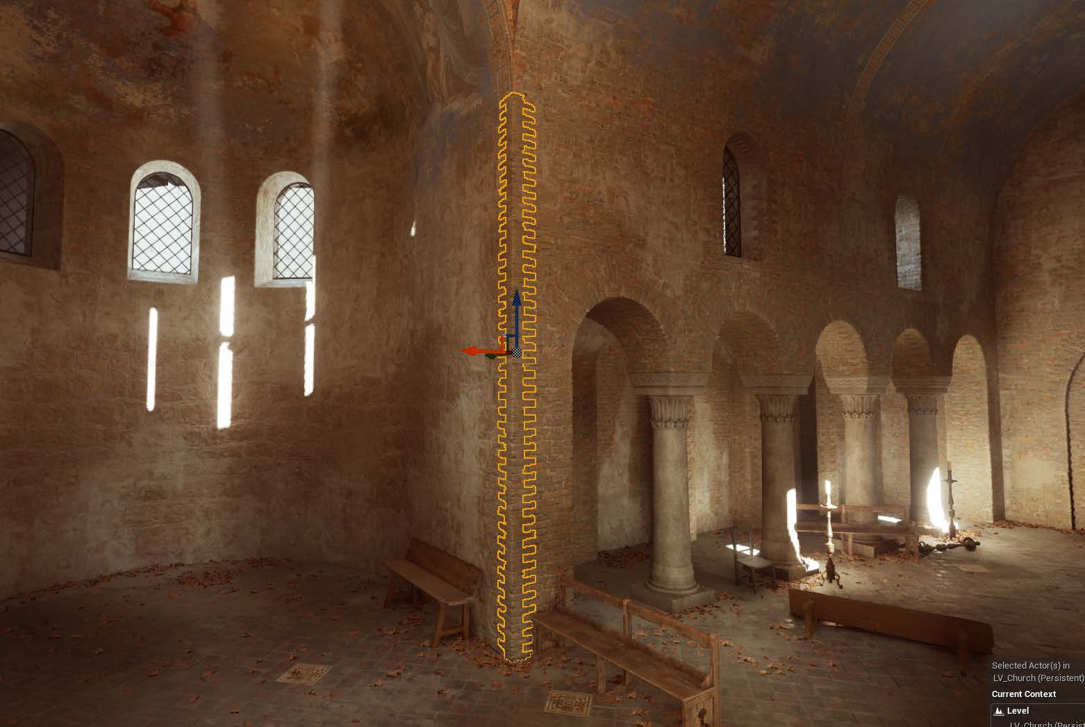
Let's take a look at how the church's structure is made:
As you can see - it’s made in a singular piece. The experienced folk can already highlight areas to break the mesh into smaller chunks - and that was something I was aware of throughout and said to myself - “This isn’t important enough to the goals of my project to care about!”
The benefit of this workflow is that I can have a consistent overview of the entire mesh, and work on it as a singular asset instead of 5-15 modular pieces that constantly need adjusting and re-importing and managing. I can also guarantee that the UVs are seamless across the entire mesh.
The downside is that you end up working with a fairly large mesh asset that can’t be culled. These are all fixable problems that can be addressed further down the line, but allowing greater flexibility during the creation process was incredibly refreshing.
Funnily enough, as I was writing this my feed was abuzz of the tools used in Source 2 to rapidly iterate in the same way - so I’ll throw my hat in with this too:
For the love of god will major engines please update their program to have in editor level design tools.
Eventually this project will be broken into modular pieces as it has to be sold on Marketplaces - but it was a fun perspective to approach a scene from instead of the usual snapmap stuff most games use these days (derogatory).
This is where a big chunk of time was dedicated to this project, and personally one of my favourite parts. I spent a few days attempting to teach myself how to sculpt rocks and bricks in zBrush, before abandoning it due to both time constraints and quality issues. I had attempted several walls in that time, but none of them got close to what I was looking for.
I’m sure I could achieve high quality sculpts eventually - but it would likely take me as long as the entire project before they would be at a quality bar I was comfortable with. It’s not a strong point of mine, but I’m happy I took a look at it.
The project felt like I was banging my head against a brick wall (heh) at this point, because I’d been working on it now for quite some time and had absolutely nothing to show for it. Progress was moving at a glacial pace and something needed to change.
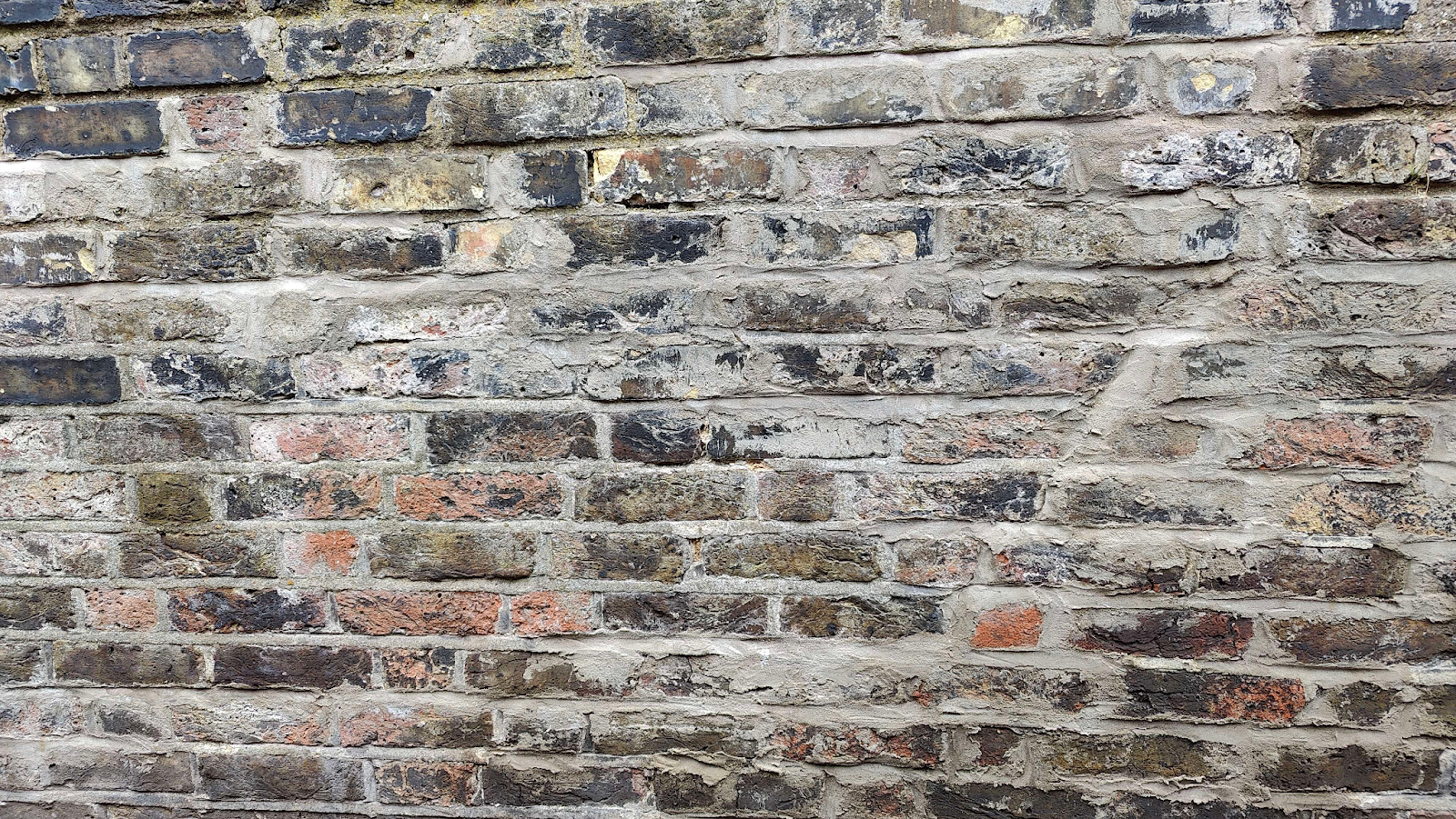
After realising that sculpting was going to take longer than I had, I started hunting around my local area for textures I could use that would match up. I searched far and wide for the specific type of wide brick that was both scannable and close to what I needed.
The main issue with the brick I was looking for is that it’s incredibly thin and wide - not something that’s found in the UK. There’s a few Roman walls in London that had potential, but they were neither accessible nor big enough to get any useful data from.
Eventually I settled on using regular brick walls, and adjusting them from there.
I actually ended up doing a scan of another wall first - this didn’t make it into the final scene, but it gave me a run-through of how to do it consistently. I wasn’t happy with the results so I went back to searching for more.
First attempt at the brick - you can see how different the end result is after extensive work in Photoshop.
Eventually after a long time searching I found a brick wall right next to my house that would work well enough that I could adjust.
I figured if I scaled the brick sideways, doubling their horizontal width - I could get something that roughly matched with minimal distortion. I also bet if I'd never told you this you would never notice it either.
My hypothesis had been correct. After another round of extensive editing I’d managed to find something that would work.
You might be asking at this point why and how the textures look so vastly different from the scan. The first one is easy to answer - it’s because they don’t look like the walls should. The second one is a bit harder to answer - and it involves a lot of masking and a lot of adjustment layers in photoshop, back and forth between the editor and a tonne of patience.
Once I’d managed to get the brick looking how I wanted, I took it into substance painter and made it tile using a clone stamp adjustment layer and once again - some patience. Because I had edited the raw diffuse, I was able to make the normal, height and AO map tile at the same time.
By now I’d decided I’d been out of the editor for too long - and quickly got it set up in Unreal using a three way material blend, and a stucco texture I threw together using another scan that used the same techniques as the wall.
The wall textures when they first came in. You can see they don’t resemble the original texture and tile horrendously. Many more tweaks happen between here and the final result - the most important thing was to lay down a base to work from.
After a few more hours of back and forth between photoshop, painter and unreal - the textures were starting to resemble what I was looking for.
A few rounds into editing the structure, hints of the fresco were helping solidify how the brick should look, and the stucco helped break up repetition and forms.
I had an extra material slot left that was currently being left unused that I wanted to fill, as I didn’t want the scene to be made up of just one type of brick. I had noticed in my references that occasionally structures like this were built using a larger form brick on the foundations, before transitioning to a smaller one up top, or had structural failures filled in with the same smaller bricks.
Before dedicating a large portion of time to finding textures, scanning them, processing them etc etc - I wanted to see if it would actually look good, so I grabbed a Megascans texture that was close enough to what I wanted and threw it into the scene.
I set out once again to find the perfect texture, and stumbled across one while away on a weekend trip to Surrey.
This actually wasn’t where I got the texture from, but the actual source is a wall about 100ft away from it. This church was used for some assets I’ll talk more about in the future.
Again I baked it down extracting Diffuse, Normal, AO & Height.
The final texture in Marmoset, after extensive editing to look how I wanted. Almost unrecognisable from the original.
While creating the structure I had wanted a way to make the corners of everything less straight. This is something that’s plagued a lot of my previous scenes - razor sharp or boring corners.
While I was out in Surrey, I noticed that the corners of the church had some beautifully detailed brick edges (how exciting) and I set to work on scanning those too.
This was a unique challenge - the bricks were conveniently laid out in a way that I could cut them out into a wall piece, but they were a different type of brick, a different colour and a different shape! Luckily with some more patience and a bit of brute force I was able to once again sculpt them into the piece I needed.
Once I had one of the corners in place, it was super easy to bend and tile them across the whole scene! I even had them in place along the arches in the ceiling. They don’t look too obvious, which is the point - but they do add an incredible amount of silhouette detail in places I wouldn’t otherwise consider.
Do they match up against the brick alignment? No. Does it matter? Also no.
Alongside texturing, I would bounce between editing the structure, lighting and layout of the church. Here in the third image above, it’s all starting to come together. The promo shot angle is also in it's infancy.
Now that the structure was in place, and large elements were finalised I started looking at the fresco in more detail.
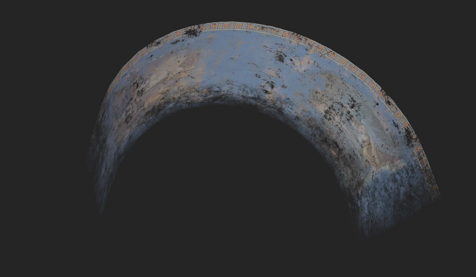
The fresco provided a unique challenge because originally I had intended to use something like a decal but noticed that it was completely unrealistic - especially for the complex shapes and angles that make up the ceiling. What I eventually realised is that you can apply decal materials to meshes to achieve the same effect, while also giving it exactly the right shape required.
I started by grabbing sections of the church from the original structure file and separating them out into their own individual meshes with unique UVs
I then took them into substance painter and slowly began building up their detail using a mixture of photo-textures from reference packs (Licensed) and general wear/tear in painter directly.
I could have done a lot more detail in regards to the fresco, but felt like it struck a good balance between the detail frequencies, as I didn’t want them to seem overwhelming, or too noisy. Another benefit of them always being on the ceiling is that texel ratios could be slightly lower - giving a bit more freedom on how much I could realistically fit on them before losing out on detail.
After spending a few weeks working away on everything else, it dawned on me that the floor had been completely neglected. I kind of knew how I wanted it to look - so I threw down the generic unreal material and adjusted from there.
And voila, the floor was done. Nothing more to be added.
Wrong.
I knew this part was relatively easy to make manually. I literally did not want to go out and find the kind of tilework I needed - it was something I felt comfortable making myself, plus I didn’t want to go asking random churches if I could take 350 photos of their floor.
I actually loathe substance designer - It’s not the tool for me, I find that procedurally generating everything is a fool’s gambit. I am incredibly impressed with what people can achieve in it, but I don’t see that ever being my passion.
So I modelled it, which is funny given how this project started.
That’s it. That’s literally all I did for the model. I baked out all the maps in Painter and started just hammering down layer after layer of textures and grunge and warps (Yes, I am completely aware these are all SD nodes) but it was fast, easy and had some fantastic results in my opinion. I knew what I wanted - and I got what I wanted.
I am also aware that this isn’t a hugely complex asset to make - it’s a bunch of squares and some thinly placed dirt. But it got the job done well, and it got it done quickly.
After that it was time for some detailing. Alongside a two way blend using the same stucco texture I used on the wall (asset reuse - not lazy, I swear), this also included some stones which were small scrunchy block meshes, as well as some leaves.
Though not huge in size (hence their tiny polycount) they do add quite a nice bit of detail in places.
The stones were actually placed using physics simulation as they were placed before I had a proper floor mesh, unlike with the leaves.
It’s an old technique I’ve been using for a while when I don’t particularly want to place hundreds of individual meshes.
As long as your collision is set up correctly you just select all the assets you want to simulate - press enable physics and simulate the scene in the editor.
Once you’re happy with where they’ve landed (you can further adjust them using the gizmo) press K on your keyboard and they’ll maintain their position. Just remember to turn off physics + dynamic objects after!
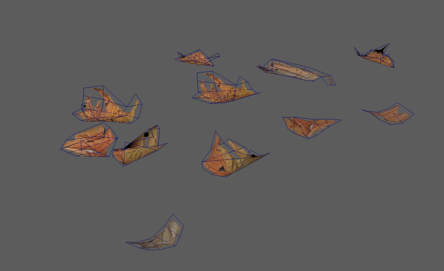
The leaves were simple, I knew they weren’t particularly large in the scene, so I was quite loose with their creation.
I grabbed a few leaves from my garden and scanned them on a rug. I used a blue background and some natural light from my house and did a quick scan from 30 images. I baked them down to a plane, edited their lighting in photoshop and bent some planes in Maya to make them look crumpled. I placed them using the foliage tool.
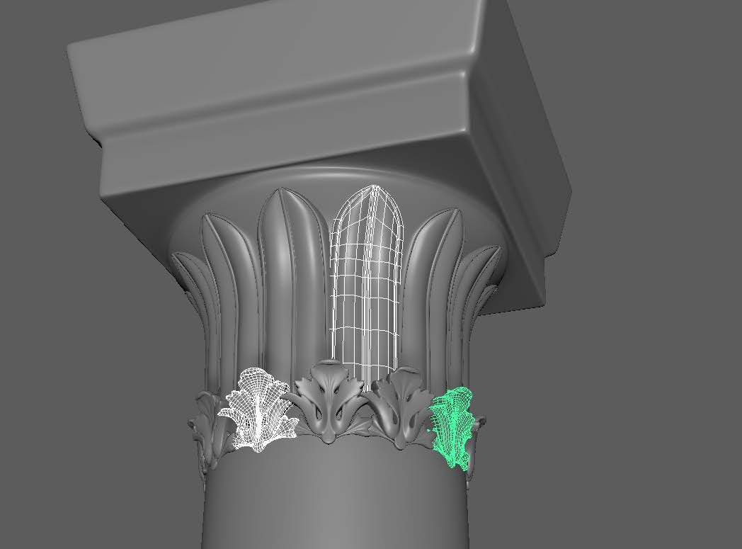
As you might see in that previous image - some pillars had crept into the scene. These were handmade in zBrush with a blockout from Maya.
I wanted the pillars to be fairly muted and not a focus. I don’t particularly find ornate pillars to be super interesting to myself, so I kept them simple.
I grabbed some filigree meshes from my resources folder (I didn’t make them, I did not want to make them) and placed them where they needed to be.
I actually went back and resculpted, rebaked and retextured the mesh at this point, as I had overdone the damages on the brick section. I’m still relatively untrained at sculpting so I made the rookie mistake of over sculpting for the sake of it.
The usual process of baking and texturing was followed here, with many iterations to get it where it needed to be in the scene. I do use photo-textures in my texturing process, but I believe this asset was textured entirely with grunge maps and procedural nodes in Painter.
This asset was something I tackled quite late on, I didn't do anything special for it - in fact I used the materials from the pillar to texture it by creating a smart material and importing it onto the new scene. I added some ground based gradient dirt and some ornate filigree here and there, but overall it wasn't anything unique or original to create this piece.
The pieces are modular and can be used in various different ways if desired.
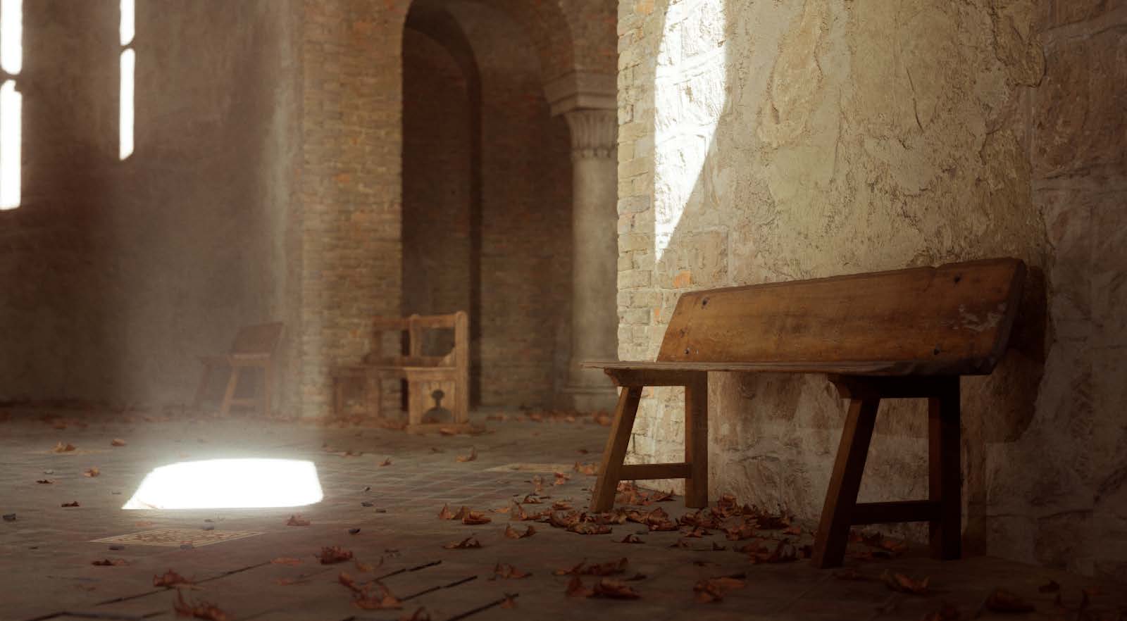
Now that I had fully established the structure of the building - I needed to start adding some of the props. Traditional Byzantine churches don’t have seating except on the edges for those less able to stand - but accuracy wasn’t the focus for this. Plus I wanted more medium detail frequency in the scene, so who was to stop me? God? This is my church baby.
I set about manually creating a bench mesh. This was a standard asset creation affair until the texturing. I’m not actually happy with the final result of this asset but decided to move onto other things.
The main (and only reason, actually) is the texturing is so muddy and inaccurate. It feels like a chocolatey blob instead of wood. I’m not going to pretty up this process and tell you that every asset is absolutely phenomenal - these kinds of scenes are a marathon and sometimes you have to know when your effort is better spent elsewhere. Luckily the rest of the scene helps bring it up to scratch. Or as it’s more commonly known: The Cheerleader Effect.
The bench used a mixture of photo-textures and grunges, but the overall result was pretty poor.
The chandelier provided some unique challenges. Again - all my choices throughout this project were justified internally for the scope of what I wanted to achieve. For this asset there was a constant battle between “should I bake the details down onto a flat plane, and risk transparency overdraw and low resolution edges, or should I use pure geometry, which is relatively cheap to render, but can get out of hand quickly?”
Eventually I settled on the latter, not because of Nanite - but because I could keep details sharper using a mesh edge instead of a texture mask. The final polycount for the chandelier sits at around 110,000 tris - which might come across as a huge amount, but considering it’s the centrepiece of the room and in my opinion the star of the show - it only makes sense to dedicate a large chunk of the poly budget to something so spectacular.
The final asset size fits on a single 2x2k texture set, at roughly 10.24ppm - it’s broken down into 10 sections and repeated in a circular fashion.
I refused to rely on nanite for the chain, and that’s baked down into a chain alpha, and given a slight silhouette breakup on the mesh so as to never appear razor sharp at glancing angles. This texture shares space with the glass alpha, to reduce texture usage.
I actually did play with a few variations of the chandelier. I spent a day rigorously modelling the entirety of the reference image I was using before deciding to scale it back. It looked goofy being so large alongside all the extra detail so I actually walked it back halfway through making it:
I knew I wanted some oversized candlesticks in the scene. I just did, none of those piddily little ones scattered about. No - this place would be filled with imposing and possibly dangerous batons adorned with burning flames of holiness. They weren’t a particularly challenging or unique object. A standard workflow was followed all the way from modelling to its placement in the scene. I used the simulation technique from the rocks to place a few of them too.
The candles were relatively straightforward - I did try to buy some candles and burn them using a blowtorch but even with scanning spray I had lying around, the texture of candles just didn’t lend themselves to being scanned very well, so I eventually resorted to just modelling them in zBrush.
I do admit I was just trying to take a more “not at my desk” approach to it.
Initially the flames were a simple image plane. Originally they weren’t animated but my good friend Bear rendered out a flipbook for them in Houdini. I edited the shader to always face the camera. There are some downsides to this method that need addressing - but they do the job!
Half way through the project I was vacationing in Spain with a group of friends. During some downtime I noticed the house we were staying in had some beautiful furniture - some were antiques and some were just old. I only had my crappy phone camera (OnePlus 10 Pro) but thought - ‘Hey, why not give it a shot?’
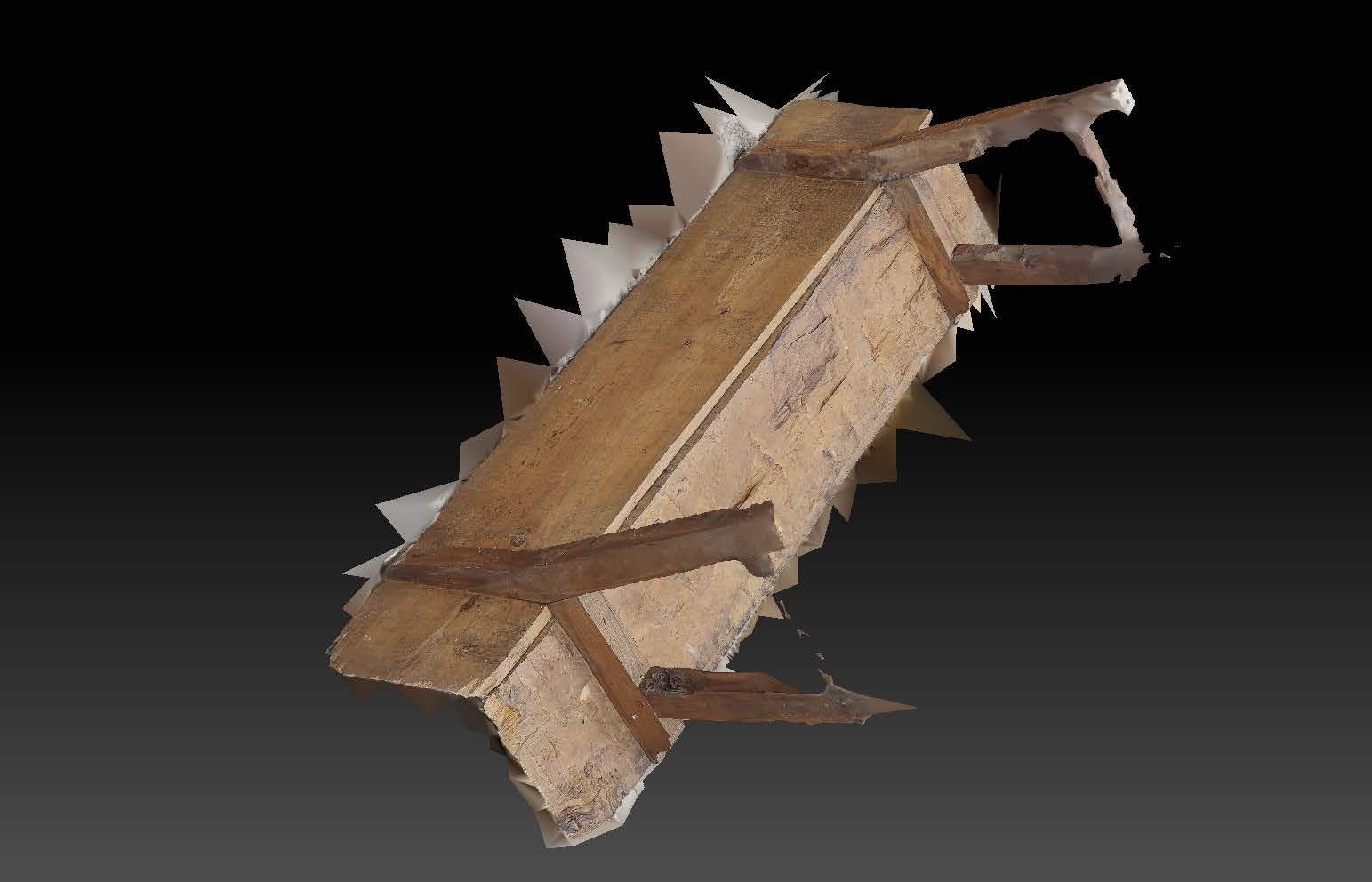
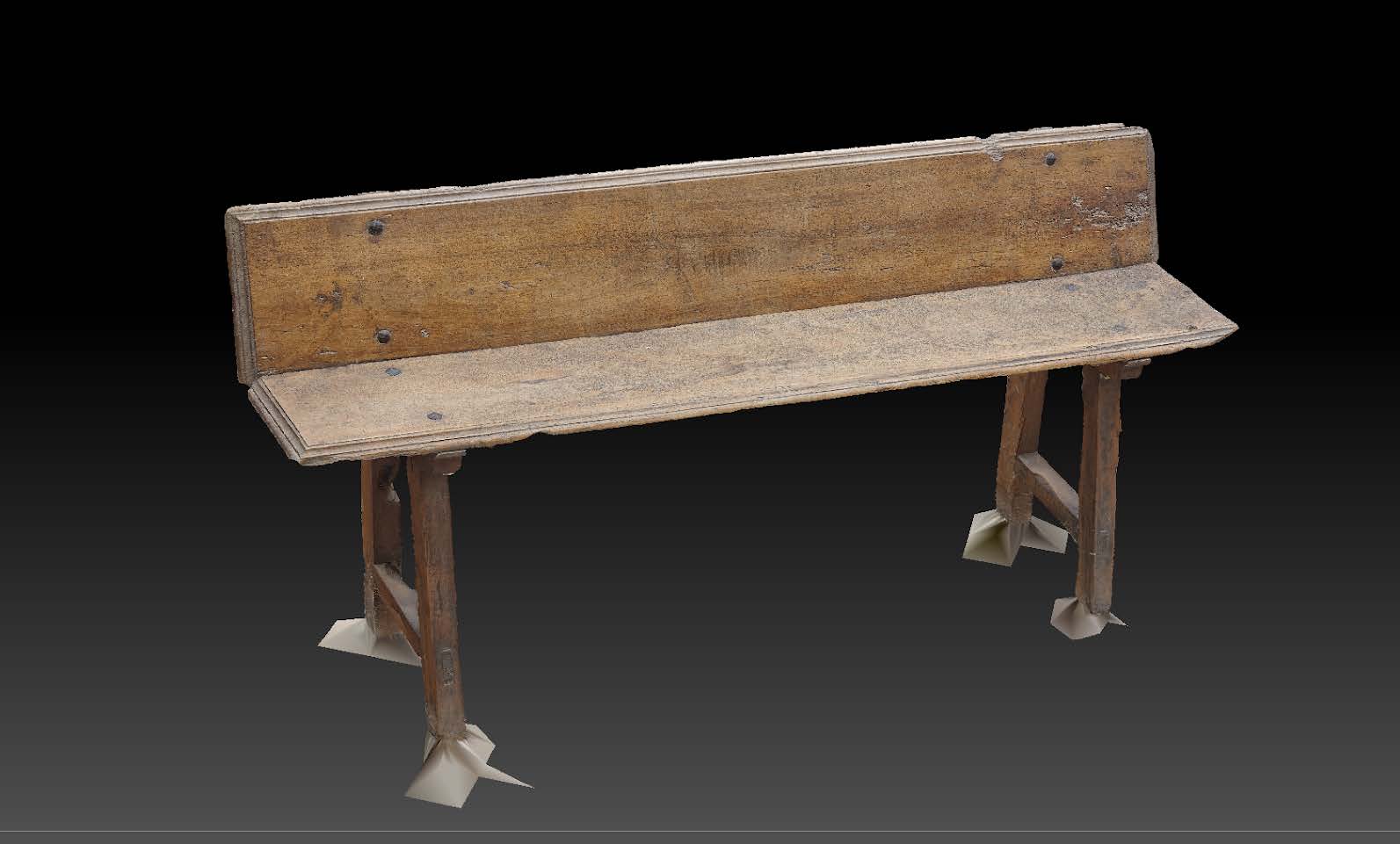
I actually tried a scanning method I hadn’t tried out just yet - using masks to get both sides of the object. I knew the general method. I just hadn’t ever tried it so I thought I’d give it a shot.
The results were mixed, the chair above worked flawlessly (somehow), but the bench required some extra (read: painful) tuning afterwards.
I'd like to reiterate that this was done on a phone camera while I was on Holiday - I wasn't expecting phenomenal results but it was exciting to get such useable assets from it.
I edited their meshes and fixed it up in Maya and Zbrush before baking them down in xNormal.
They always require a bit of clean-up, but some elements really shine from the decimated (and tidied up) mesh. There's non-straight edges that you otherwise wouldn't model normally.
I’ll take the raw diffuse into photoshop and adjust the lighting for an initial pass. After that I take them into Painter and use the clone stamp tool to fix up any areas the scan missed, or just paint out certain elements I don’t like.
The chair is one of my favourite assets from the project - it’s not perfect by a longshot and the resolution is a bit crap but it makes up for it in its character. It’s janky, unsafe to sit on and falling apart - but look at it!
The bench required some painful cleanup, a few hours cleaning up the garbage decimated mesh, and then some more getting the legs to work correctly. This mesh isn’t the cleanest but the beauty of scan data is that you can get away with quite a lot with just how gorgeous the textures are in the final result.
So, I'm not stranger to asset reuse - and in fact one of the main reasons I wanted to salvage that bench scan so much is for the potential for asset recycling. Since I knew all these asset would be in the same scene I could get away with them sharing textures. There's a few assets in the scene that reuse the bench's material. Here's a few examples:
This asset isn't very prominent in the scene, but I wanted to see how far I could push the wood texture using it.
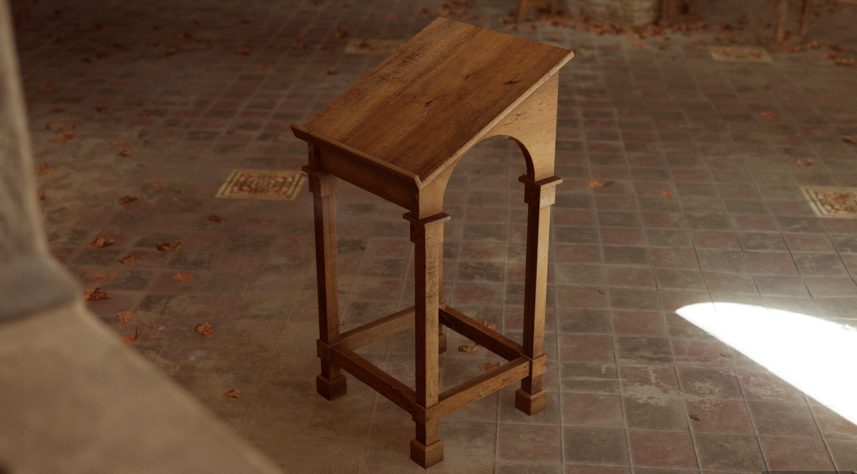
The lectern used a similar asset reuse technique, except the other way around.
I used the bench's diffuse texture in Substance painter in order to lay down materials in painter and then layer dirt and other details over the top of it. Ideally I would have used the same technique as the ladder, but it was fun to try both. Each method has their pros and cons.
That's all for now, this page might be updated in the future with some more information. I'm also starting work on a Youtube breakdown for those of you who enjoy video content.
Yes it WILL have a clickbait title and YES it will directed towards non game artists for the most part.